Posts

Showing posts from February, 2017

Bruno Bettelheim

Image
The Uses of Enchantment : The Meaning and Importance of Fairy Tales is a book by American author Bruno Bettelheim. in which he analyses fairy tales using psychoanalysis. Bettelheim believes that fairy tales help children solve certain problems such separation anxiety, conflict, and sibling rivalries. The book, "The Frog King", may be in relation to modern sex education in the sense that it acknowledges that a child may find sex disgusting, and this may serve as protection for the child. In the book he presents psychoanalytical readings of several popular fairy tales, specifically: Hansel and Gretel Little Red Riding Hood  Jack and the Beanstalk Snow White Goldilocks and the Three Bears The Sleeping Beauty Cinderella  Although I find this interesting to read his theories I do not agree with them all, this is because I don't think children have a deeper understanding past its initial message.

Walter Disney Reseach

Image
Walter Elias Disney was an American entrepreneur, animator, voice actor and film producer. Most Famous for Disney film, having won 22 Oscars from 59 nominations, 2 Golden Globes and one Emmy Award among others. He created the character, Mickey Mouse, in 1928 he also provided the voice for his creation in the early years. As Disney grew they introduced new and adventurous techniques, introduced synchronised sound, full-colour three strip Technicolour, feature length cartoons and technical development in cameras. These techniques were used to produce the films: Snow White and the Seven Dwarfs Fantasia Pinocchio Dumbo Bambi  Later production and development gave new animated and live- action films following the second world war, which includes Cinderella and Mary Poppins. In the 1950s, Disney expanded into the amusement park industry and in 1955 opened Disneyland. To fund his project he diversified into television programs such as Walt Disney's Disneyland and The Mickey Mo

Final Major Project

Image
For my Final Major project I want to focus on Disney and how most of their films are all sweet and innocent and end in "happily ever after" yet are based from more sinister and gruesome stories. My initial idea is to use illustrations either digitally or hand drawn to  achieve the effect I want. I will be researching Walt Disney and anything else I feel represents Disney and inspires me for my final piece.

Human Rights Evaluation

Image

Magazine Final Piece

Image
Cover Page 1 Page 2  When creating the final piece I tried to keep all the text professional as well as using my own knowledge instead of copying  everything from websites, when I have used text from others I have made sure to add web links to the bottom of each paragraph. Page 4 Back I used the photo manipulated image of models, this is because it is the most like a normal fashion magazine. I took inspiration for the layout from my research page, "Harper's Bazzar Sinagpore Magazine", and kept the text close to the images so the audience knows which text is meant for what images. If I could change anything I would check for grammatical errors and add a few more images, I would also add the cool green colour as the background on each page to make each page blend together better and look professional.

Free the Nipples

Image
After Before Free the Nipple is a sketch I made to represent a recent Feminism campaign/march, to try and take away the sexual stigma women's boobs have. This is because it is perceived that women should not breast feed in public and go around topless as its seen as sexual, where as men are free to walk around topless without any stigma. I drew two rough nipples using Photoshop, I wanted the two nipples to be very different in shape, colour and texture, this is because not all nipples are similar. To blend in the highlights and shadows I used a new technique, I tried using the "mixer tool", as it helps blend colours together, I had to trial changing the wetness, size and mix to get the right consistency I wanted. The final design of this image I love as you can see the brush strokes, which I really wanted as boobs are a natural things, I also love how the colours have blended together. If I could change anything I would trial a different font as I'm not

Floral Designed Model Photo manipulation

Image
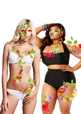
I chose two different sized and shaped models to show that women should be happy with who they are no matter how they look. I took inspiration from the, "Diesel Research" , that I previously looked at, I first opened the two model images in a new Photoshop project, I then worked on each model individually and used the lasso tool to choose places to cut the model and insert flowers and leaves underneath. After I then saved each model individually and opened them in illustrator, I then used the pen tool to draw over one side of the cut model to add a 3D effect, I chose two different colours to show that everyone is different and unique. I changed the uniform of the line to be a more thick and ends really thin. This is so the line looks more realistic and blend into the image better.

Floral Typography

Image
 I printed out a page with the chosen font for my front cover, I then sketched out a simple floral design around the text. I then photographed the image and drew it digitally on my Surface Pro 4 using Photoshop.  My favourite piece of the typography was adding colour as its a contrast against the black font and draws in the audiences eye. If I could change anything I would trial different types of flowers so I had a large variation.

Rough Sketches

Image
take care of yourself body types love yourself human trafficking   These are a few Rough sketches i drew to help me get my Ideas right before drawing digitally on my Surface Pro 4. I used Photoshop and traced the picture using a hard brush , I like using my Surface Pro 4 and pen to draw as i can choose how thick the line should be by simply using different pressures. My favourite piece is, "love yourself", as i think it gets the message of being happy no matter what your body shape or size is. If I could change anything I would add more shading and tone to the piece, "body confidence", as it looks very simple and i think it would add more detail without taking attention away from the message.

Human Trafficking Photography Trials

Image
"Drugged up" Before taking any pictures I drew out some rough sketches of objects I thought related to Human Trafficking. When taking these images I wanted to try and show how people who are being trafficked for sex, feel emotionally and physically. I took inspiration from both Natalia Drepina and Noell Oswald by having minimal colour as well as making the images look faded. My first image, "drugged up", is to show how human traffickers drug up their women to get them so addicted they will do anything for their next fix. This was difficult to take as the taste of the pills were making me flinch because of the taste of them. I really like how the image came out as it looks very effective and shows how addicted women/men who are being trafficked for sex can get to the drugs. "drowning in my own impurity" My second image, "drowning in my own impurity", is meant to show how impure the women/men feel after every "sex sale&quo

Fight for your rights

Image
Feminists have been doing a lot of women's marches and protests recently so I wanted to show this through a Illustration drawing. Like my "Love Yourself" images I trialed different skin colours to show ALL women come together to fight for equal rights. I got inspiration from an image I found on Pinterest , I didn't add a background colour as I thought it would take the attention away from the fist and the goal. If i could change anything i would add a different font as I think the font I have used is a bit messy and doesnt look like it relates to the image.

Love Yourself

Image
 For another Illustration about body confidence and going against stigma, I took inspiration from an artist I found on Pinterest , I wanted to trial different ethnic colours as to show it doesn't matter your race or ethnicity we are all amazingly beautiful. I changed the heart to be plain and the outline to be covered in leaves, I also trialed different hairstyles but set for a curly short bun hairstyle. If I could change anything I would add colour to the leaves and also trial fonts instead of my own free hand text, as it would look more professional.

We are Beautiful

Image
For this Illustration (made on the 27th January) I wanted to have a variety of body sizes and shapes to show no matter your size or weight we are all beautiful. I did a rough sketch in my sketch book which i later developed digitally on my surface pro 4. I wanted to keep the image quite simplistic with minimal colour. I also decided to keep the text quite natural so I free-handed the text. If i could change anything i would try and add shading up to add a bit more detail to the piece as it isn't very eye catching. I took inspiration from an illustraion I found on Pinterest (Image on the Right) it involoved images of 6 different body shapes and a free hand text. I tried to mix up some of the underwear for different sized and shaped women.

Stormtrooper Feminism

Image
Monday 30th, I decided to go for a more brandalism kind of approach, I wanted to take a well known film and develop it into a Feminist illustration. The film I chose was, Star Wars, this is because you see a lot of male characters and not many females especially as stormtroopers, with the exception of the newest film. I decided to have a female stormtrooper pointing a laser gun at a male stormtrooper as he is sexualising her, he does this by imagining her naked. I wanted this to work like a brandalism poster but also have comedic value. I trialled different colour variations, one being the storm troopers in their best related gender colours, e.g. pink for females, blue for males. I also trialed the image being in black and white. If I could change anything i would try and trial different fonts and how bold they are, this is because I'm not sure the text blends in with the image, i think it looks a bit out of place.

Digital Skeletons

Image
Today (27th January), I thought about how I could show that all women are beautiful no matter their body size, as there is a lot of stigma around women to be the medias sense of "beautiful". This means being skinny yet curvy, big boobs, big bum and small facial features. I first drew out a rough sketch of a skeleton and then photographed it and added it onto my surface pro to edit and develop digitally. After I added a rough sketch of skinny, medium and large bodies on top of the skeleton each put onto individual layers and given a bright colour. After I saved each skeleton individually I added each skeleton onto a new page, and got all the skeletons to hold hands to show that women should be united and not be jealous of each other. I trialed a variety of text colours and layouts but found that the red text in the layout "multiply" worked best. If I could change anything I would make sure the grammar was correct, e.g. what's instead of whats, and also try

New Route

Image
I have decided to choose one topic for my final piece, this will be Feminism, I feel very strongly about feminism as a feminist myself. I have thought about adding photo-manipulation and illustrations work around Feminism into the magazine. I will also take inspiration from my two research pages about magazine layout and typography. In the future I will be uploading my illustrations and where i got my inspiration from by adding a visual aide and link. Here is my first Illustrational drawing I have done digitally, this was originally a rough sketch that i did in one of my sketch books which I later photographed and developed further in photoshop. I was inspired by women wanting there to be no stigma against women who have leg hair/arm pit hair.

Infographics

Image
Infographics is a visual representation of information or data, Jonathan Barnbrook as well as doing brandalism he created , "the little book of shocking global facts" , which is a book full of infographic art in it to show global disasters in a more eye catching and digital way instead of a poster. To me I'm drawn to his work visually as it has a lot of bright colours and shapes which helps move you from one page to another effectively. This has inspired me to try and use colour and shapes/arrows to help the audience through the book as well as think how big/small some images/shapes should be. The website RightsInfo uses simplistic graphic design images to create an interesting yet informative piece of work to show/explain our human rights. To me the contrast in the background and colourful foreground, this works well as your eye is drawn straight to the colourful imagery, the use of text is also very effective as its above the imagery as well as being big enough t